I know, I know, another video about shooting video in log on iPhones? I promise I’ll move on to other topics, but two events happening in one week pushed me into making this video:
- Samsung adding log to the Galaxy s25 Ultra
- My brother-in-law texting me “Do you have a fix for iPhone videos looking washed-out?”
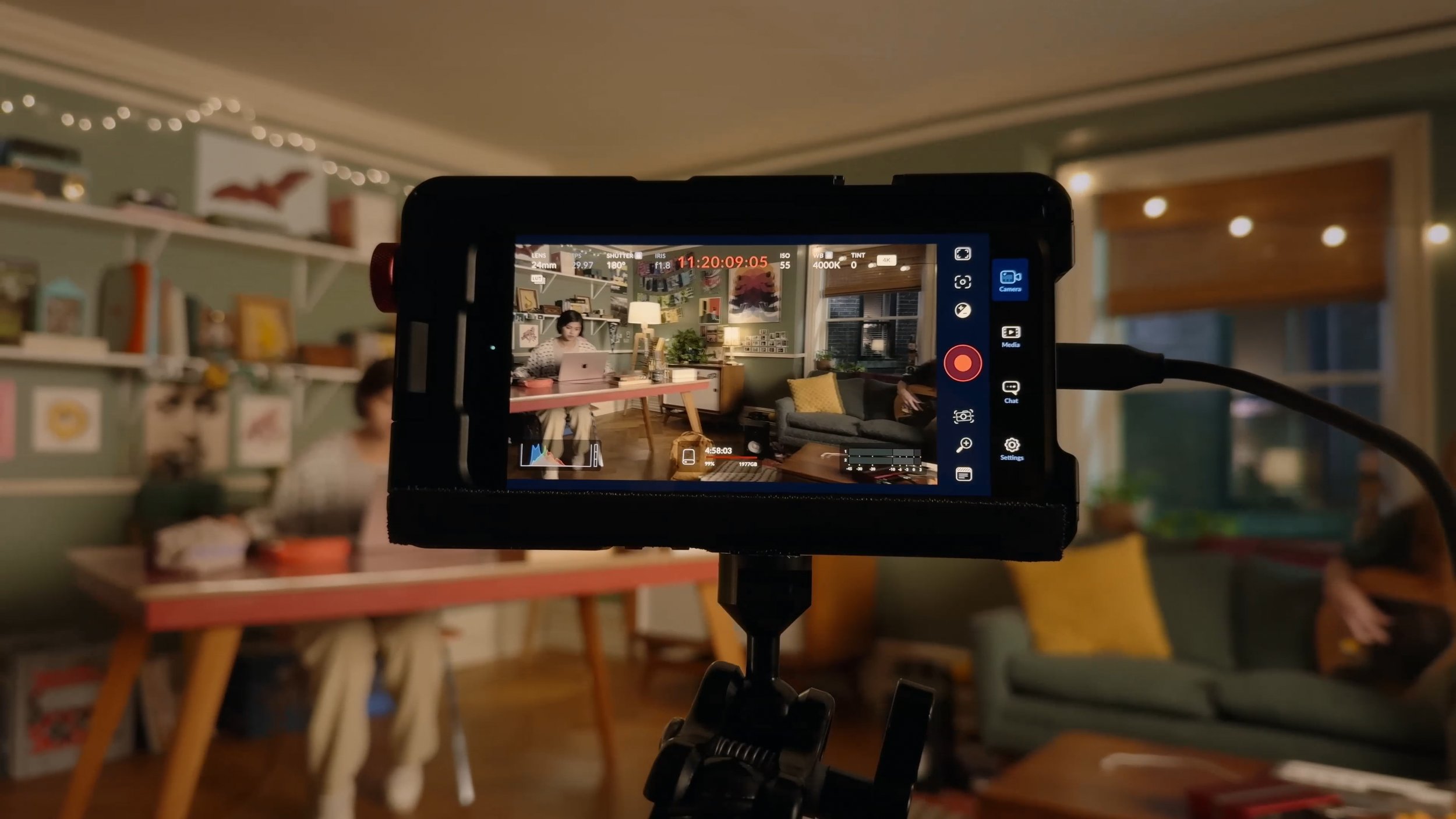
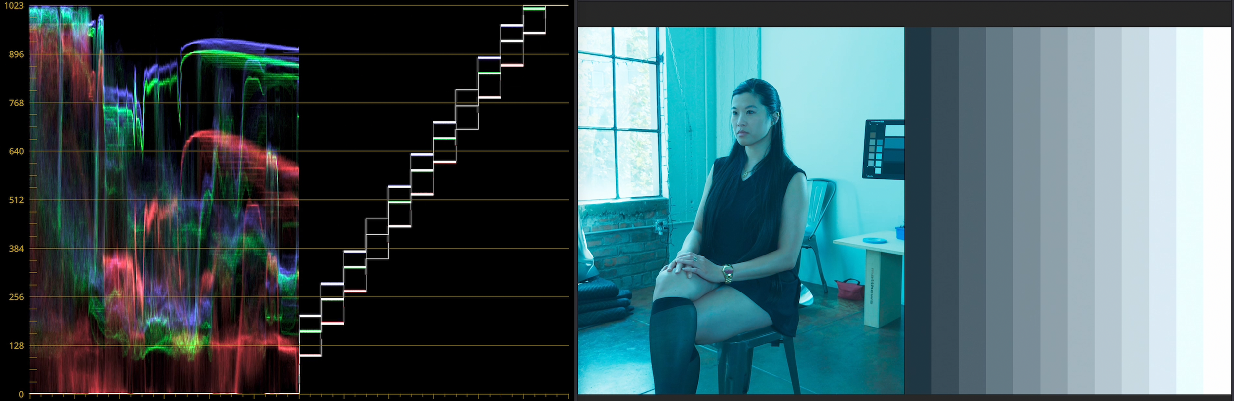
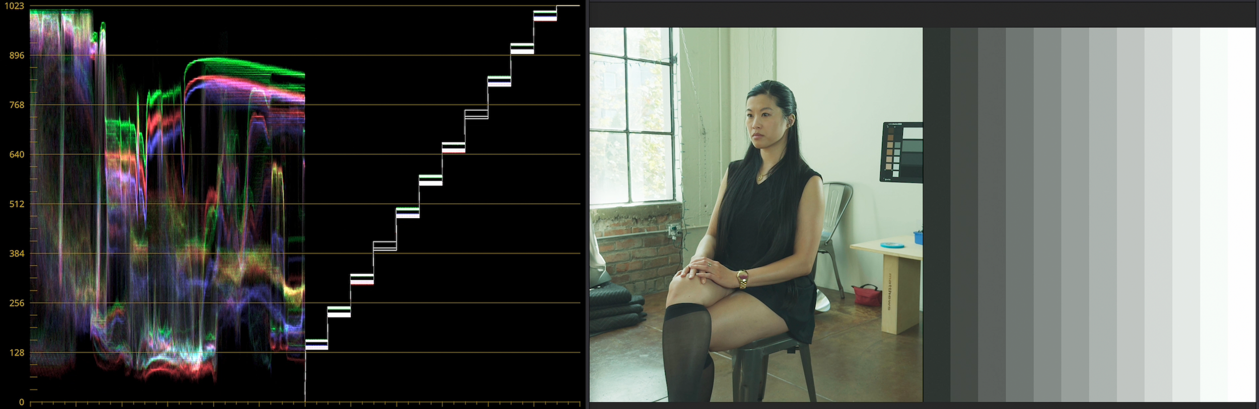
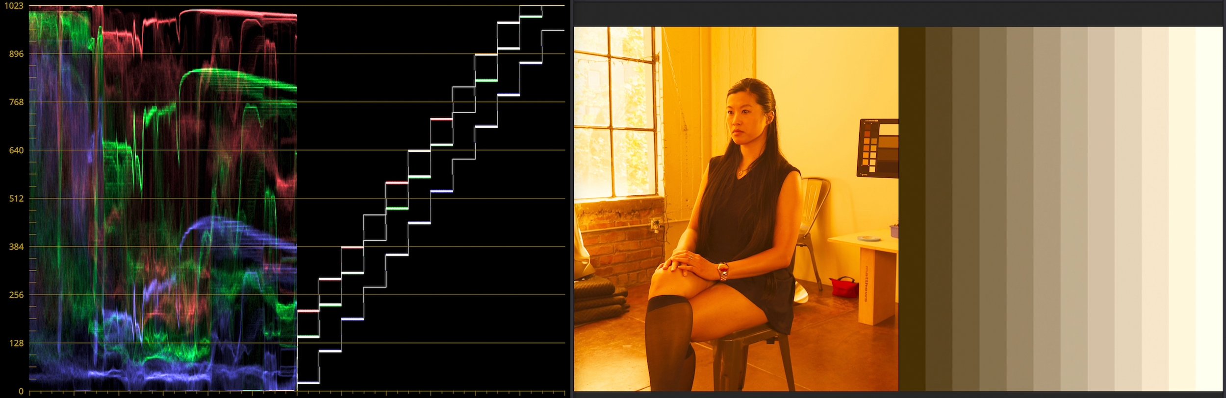
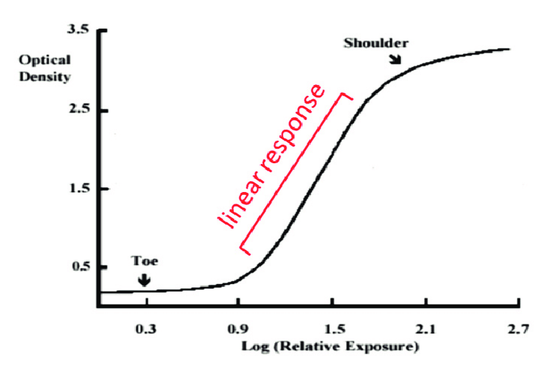
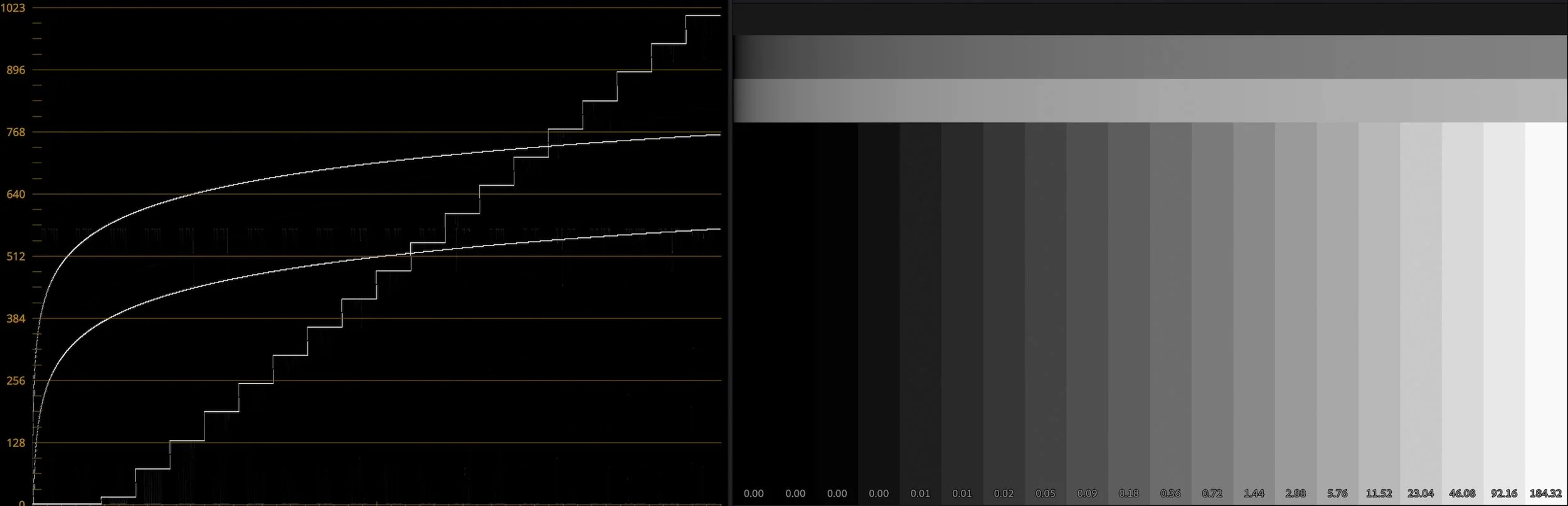
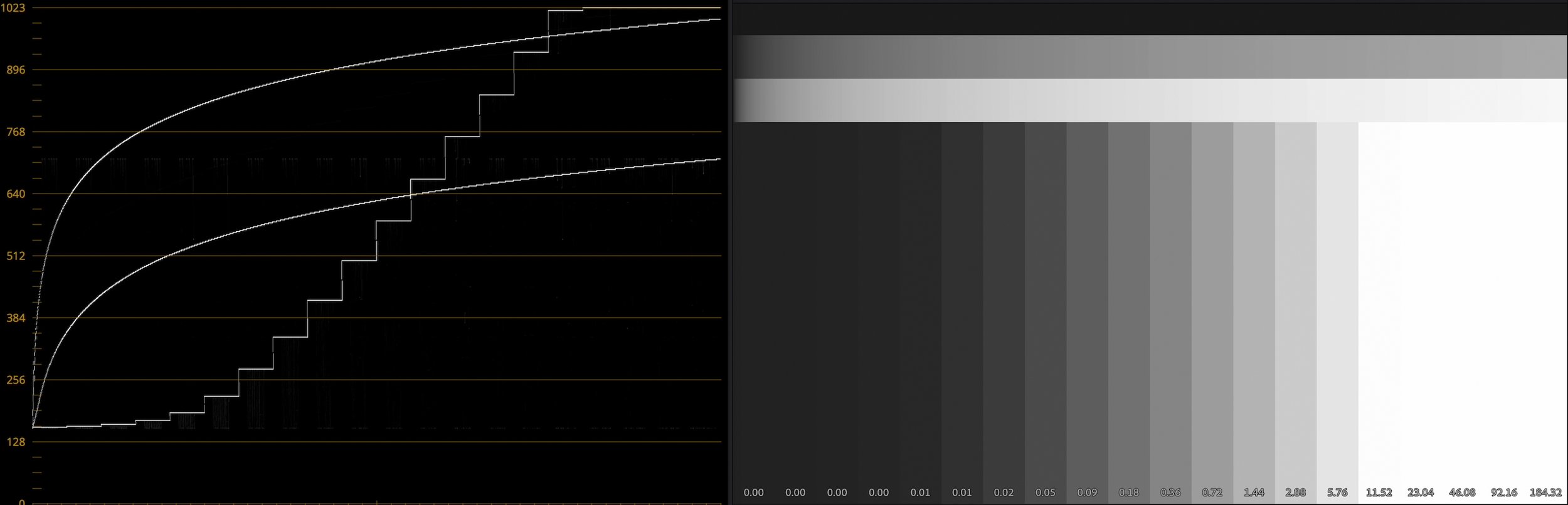
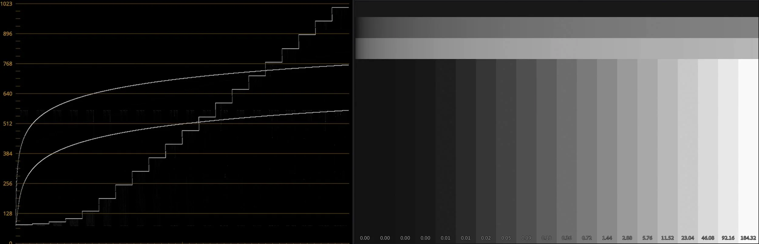
Why is log important, even to Samsung, who never met a color they didn’t crank to eleven? Why does non-log iPhone footage often look bright and desaturated in editing software? Why does log matter from a creative standpoint, not just the technical reasons I covered in my previous videos? Is it OK to shoot log in highly-compressed HEVC instead of ProRes?
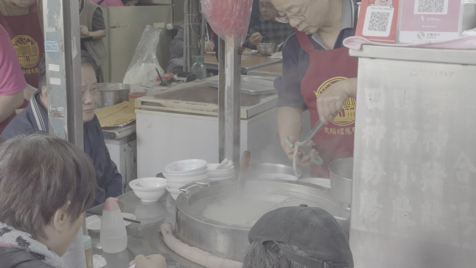
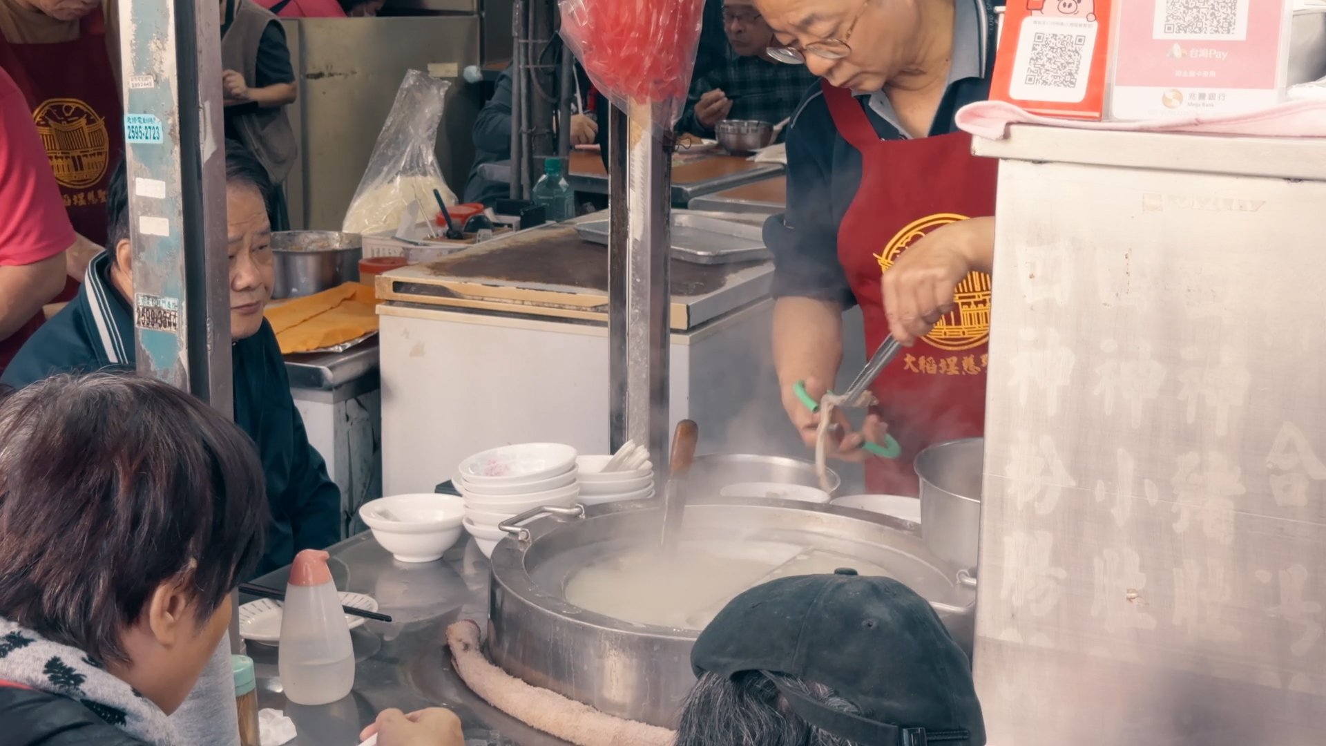
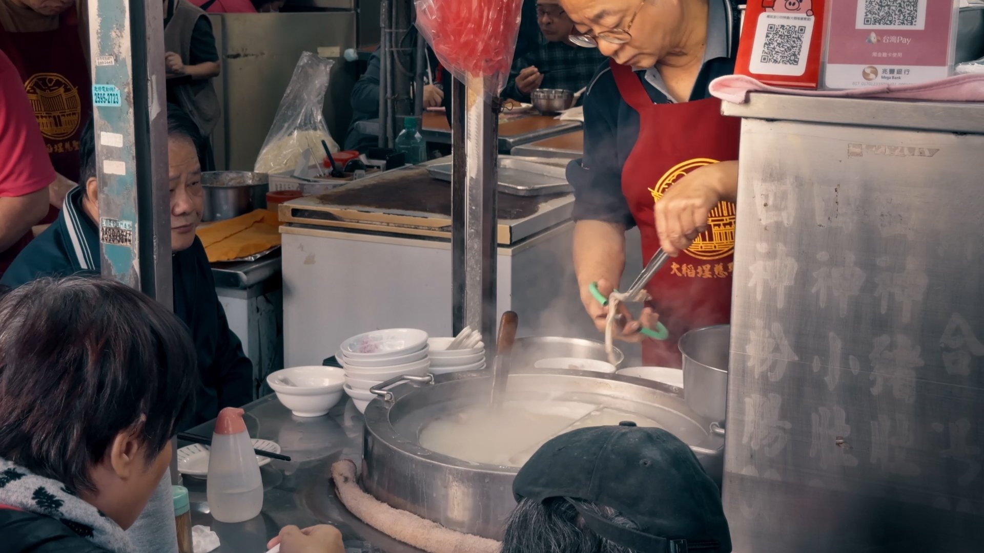
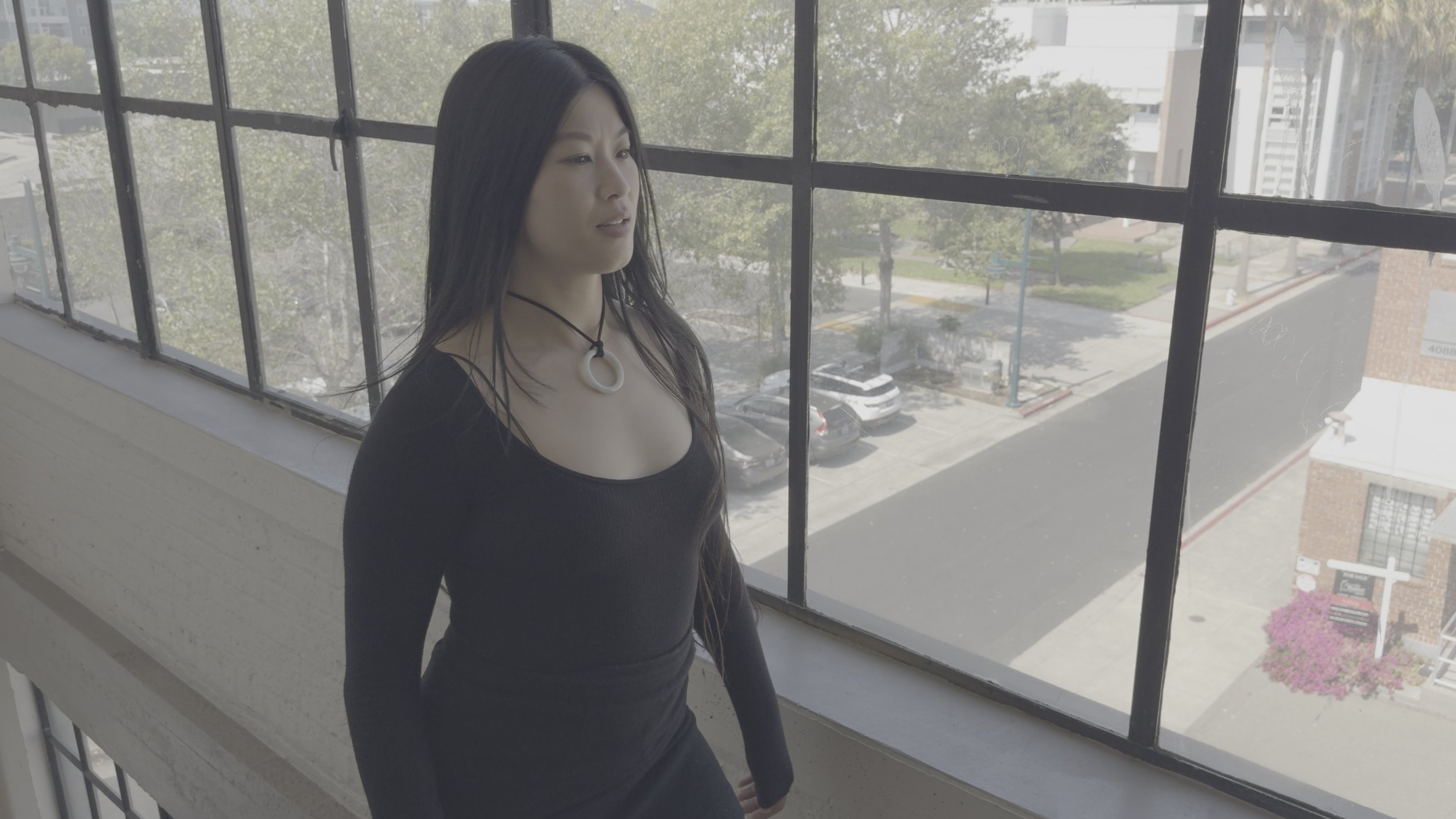
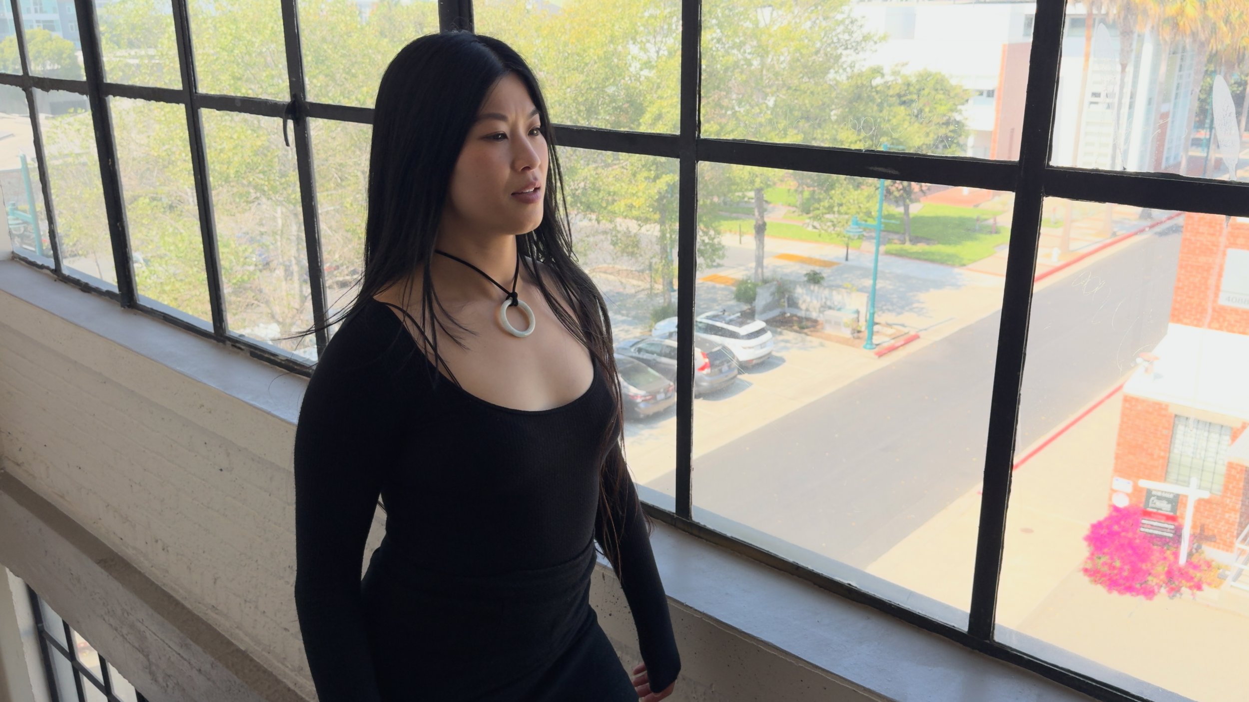
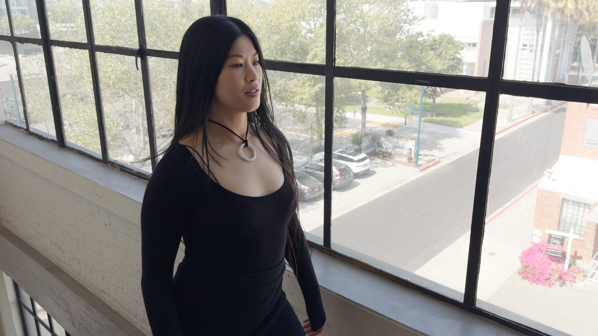
To answer all these questions, I’ve got my longest video yet, and some new free LUTs for working with non-log HDR iPhone footage. The meat of the video is a “Color Grade With Me” tour through some of the more interesting shots from my Peru and Taiwan travelogue edits, where I dive into the creative possibilities afforded by log.
And is it worth the squeeze?
Being me, I also used these topics as an excuse to share a philosophical view of how I look at any given camera. I hope you enjoy this more creative, less technical video. My goal this year is to make more, so please drop a comment on the video or on Bluesky letting me know what topics you’d like to see me cover.