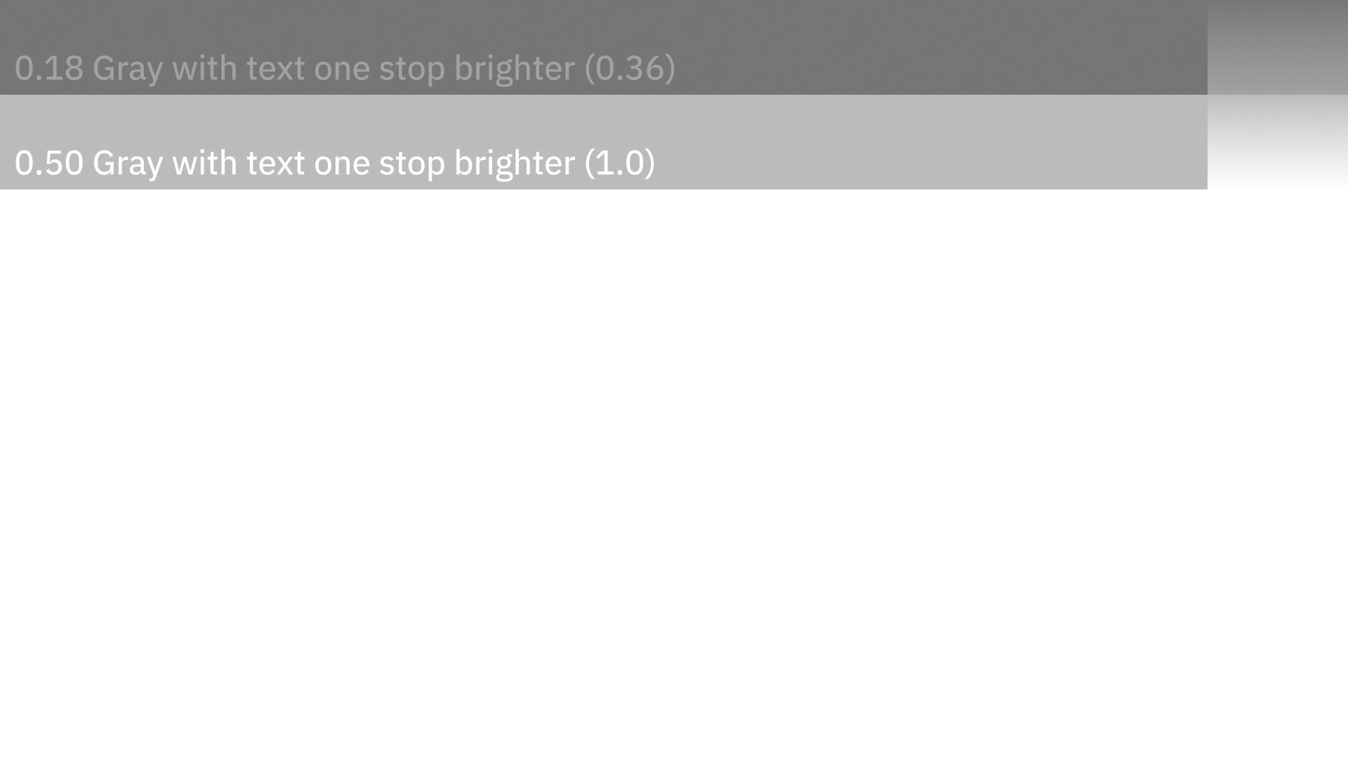
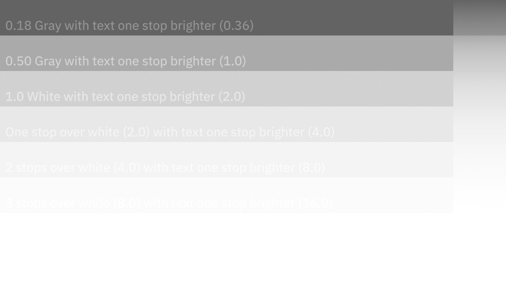
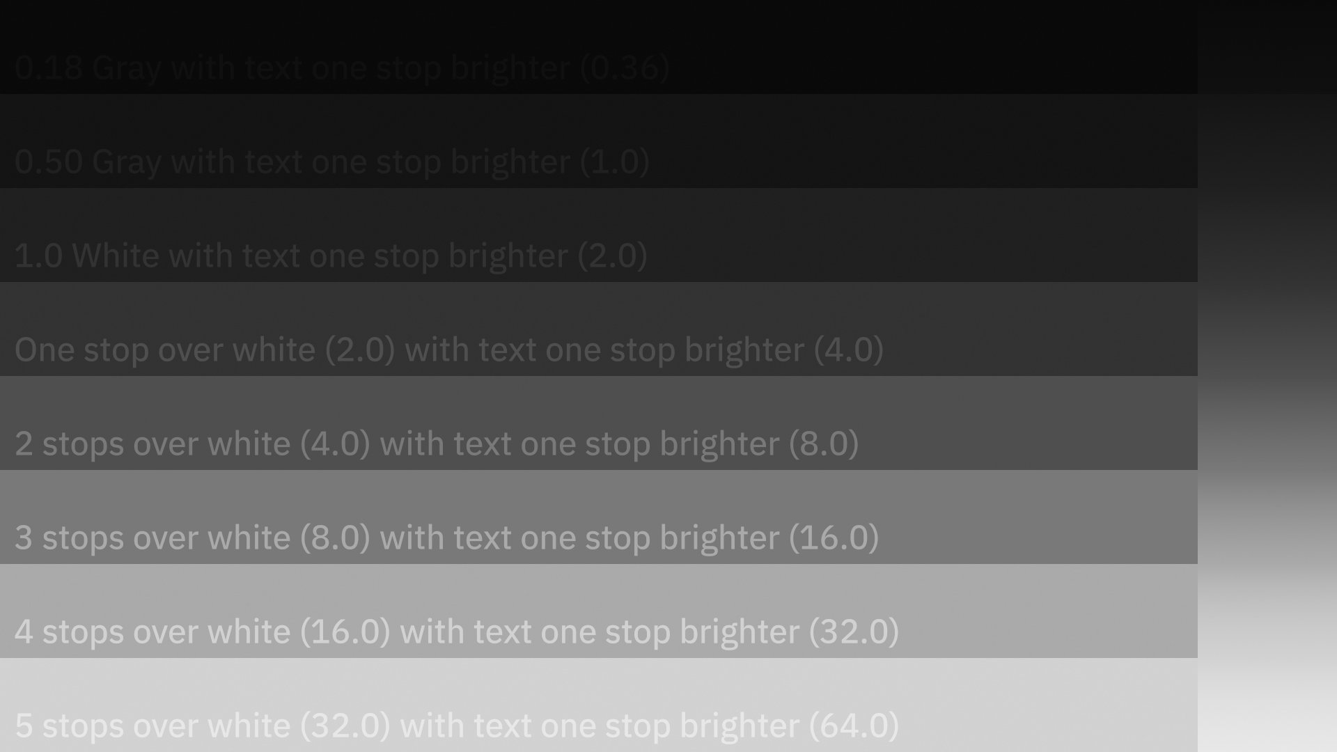
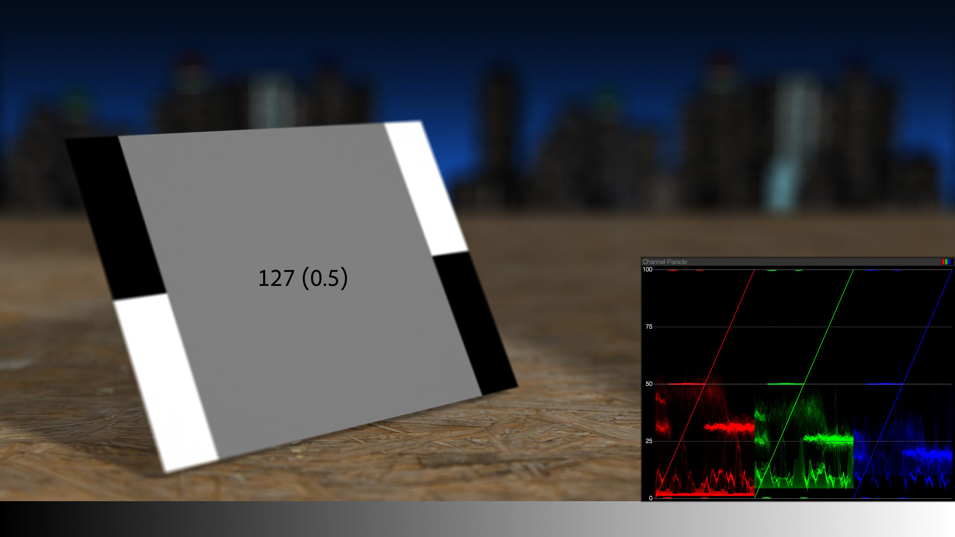
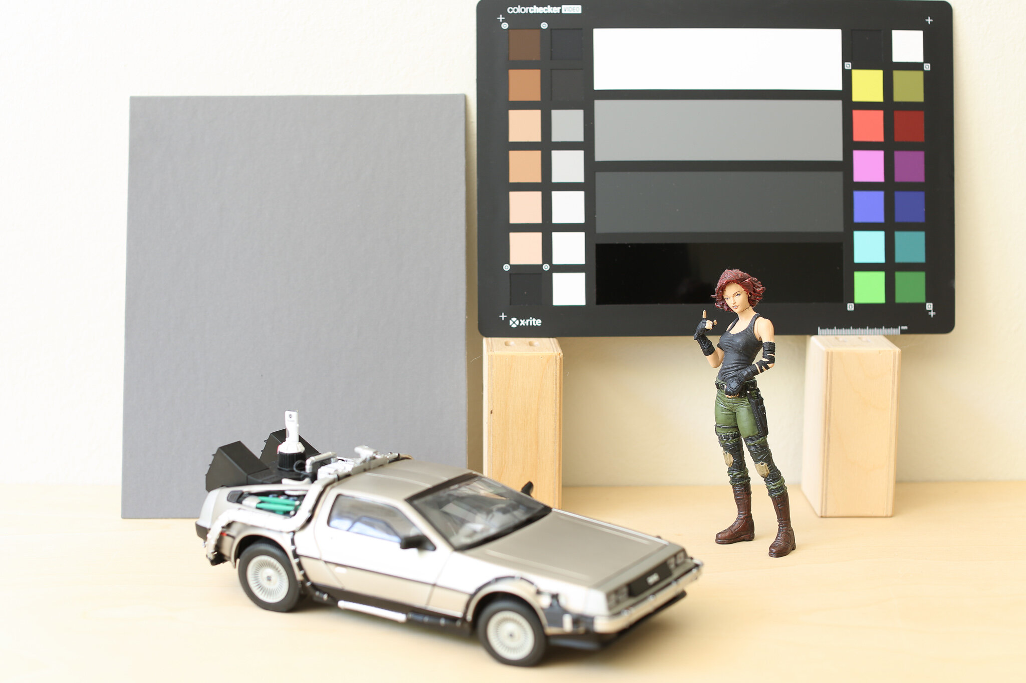
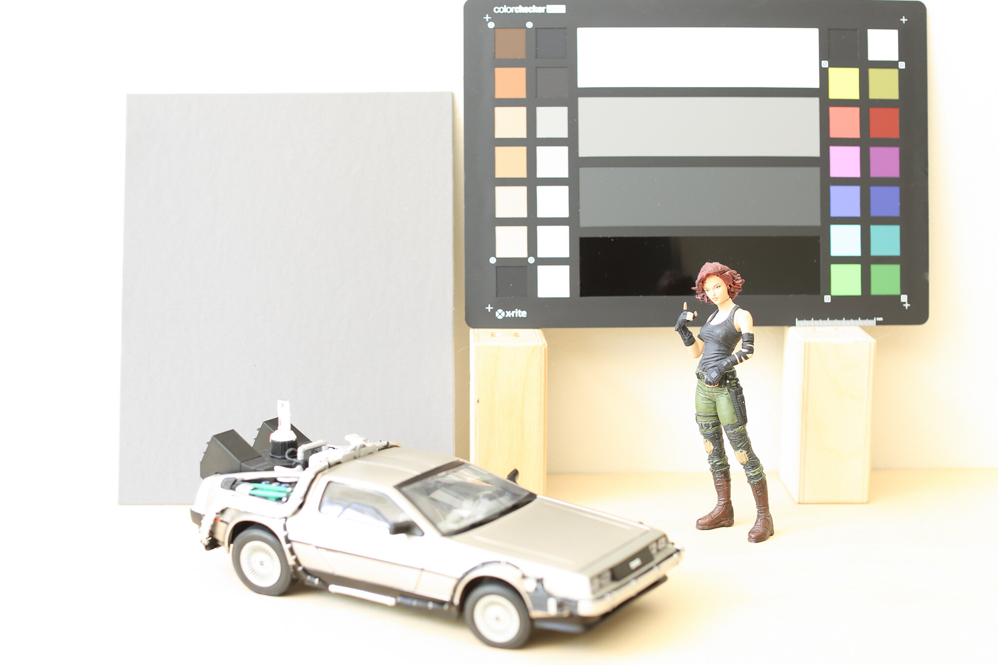
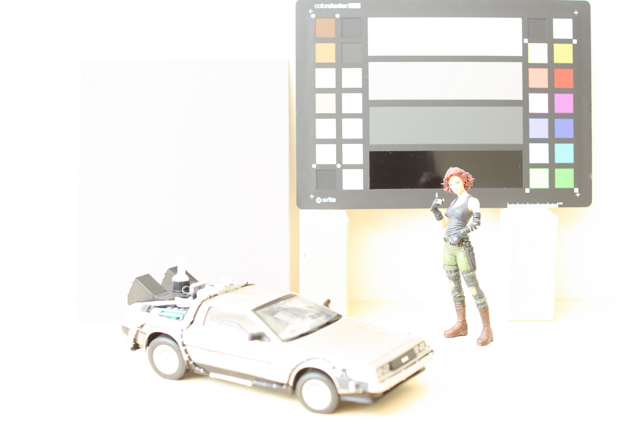
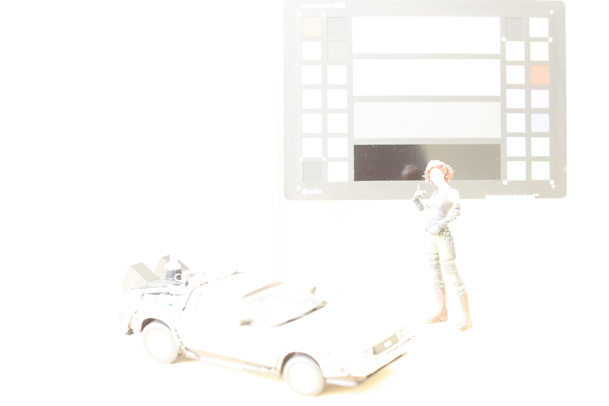
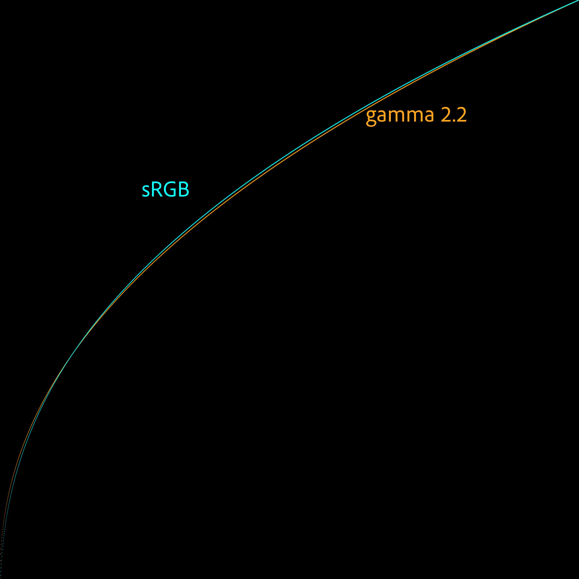
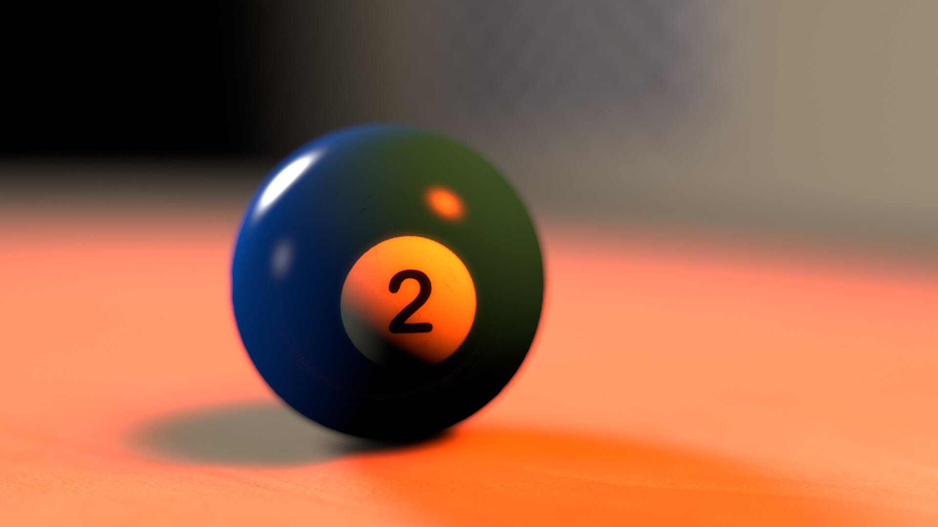
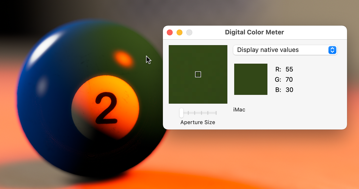
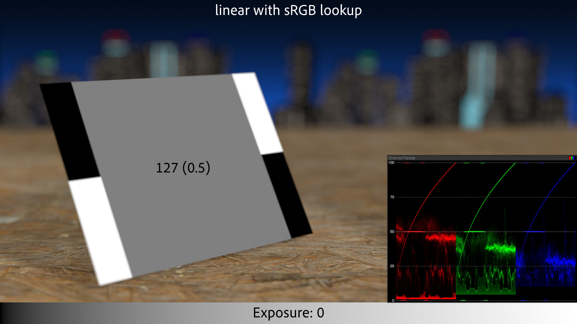
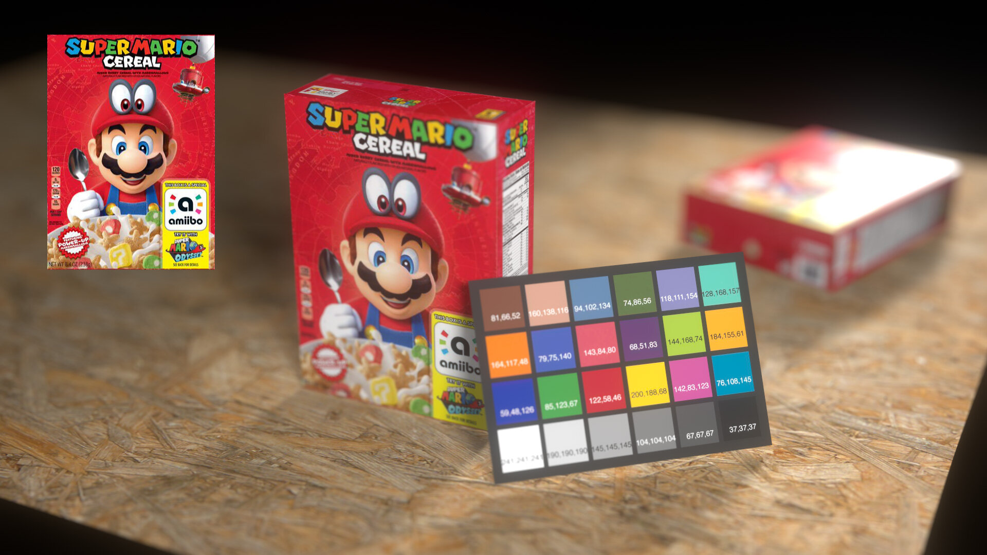
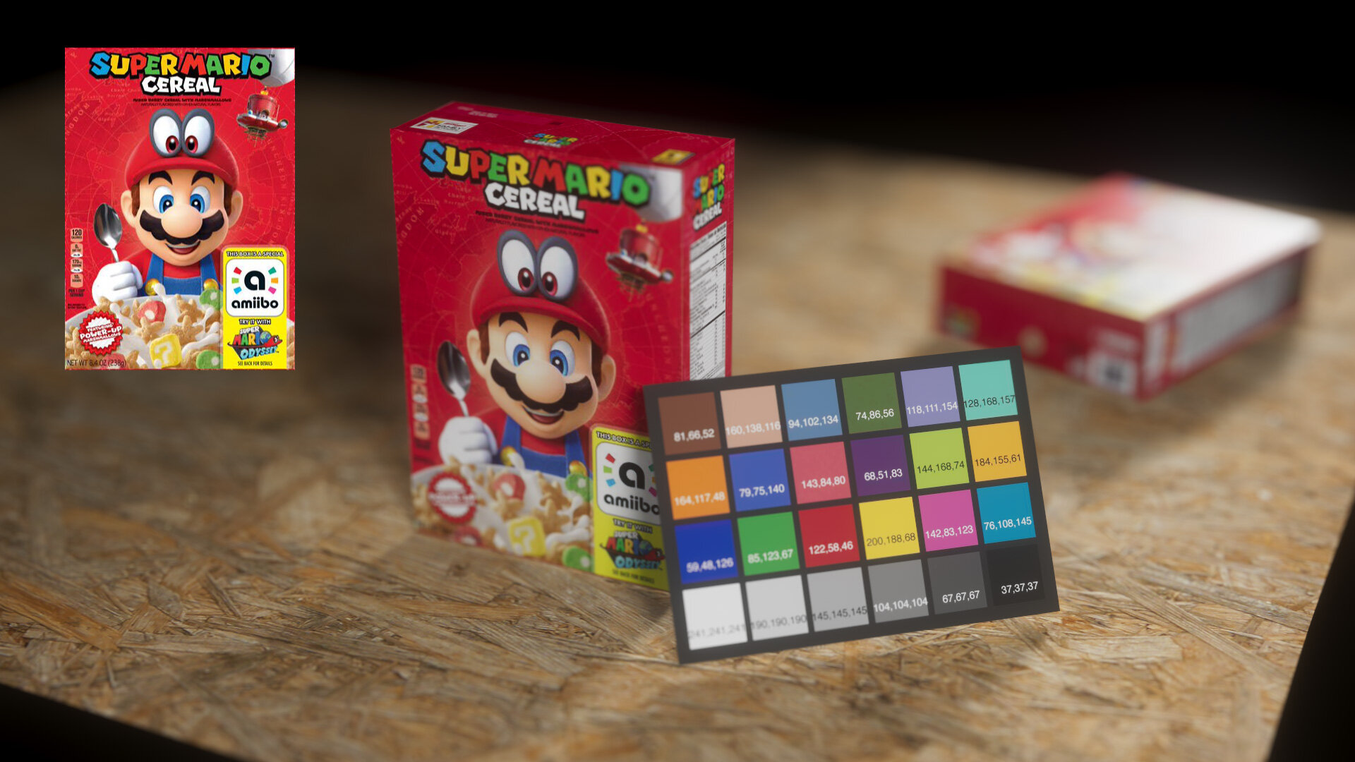
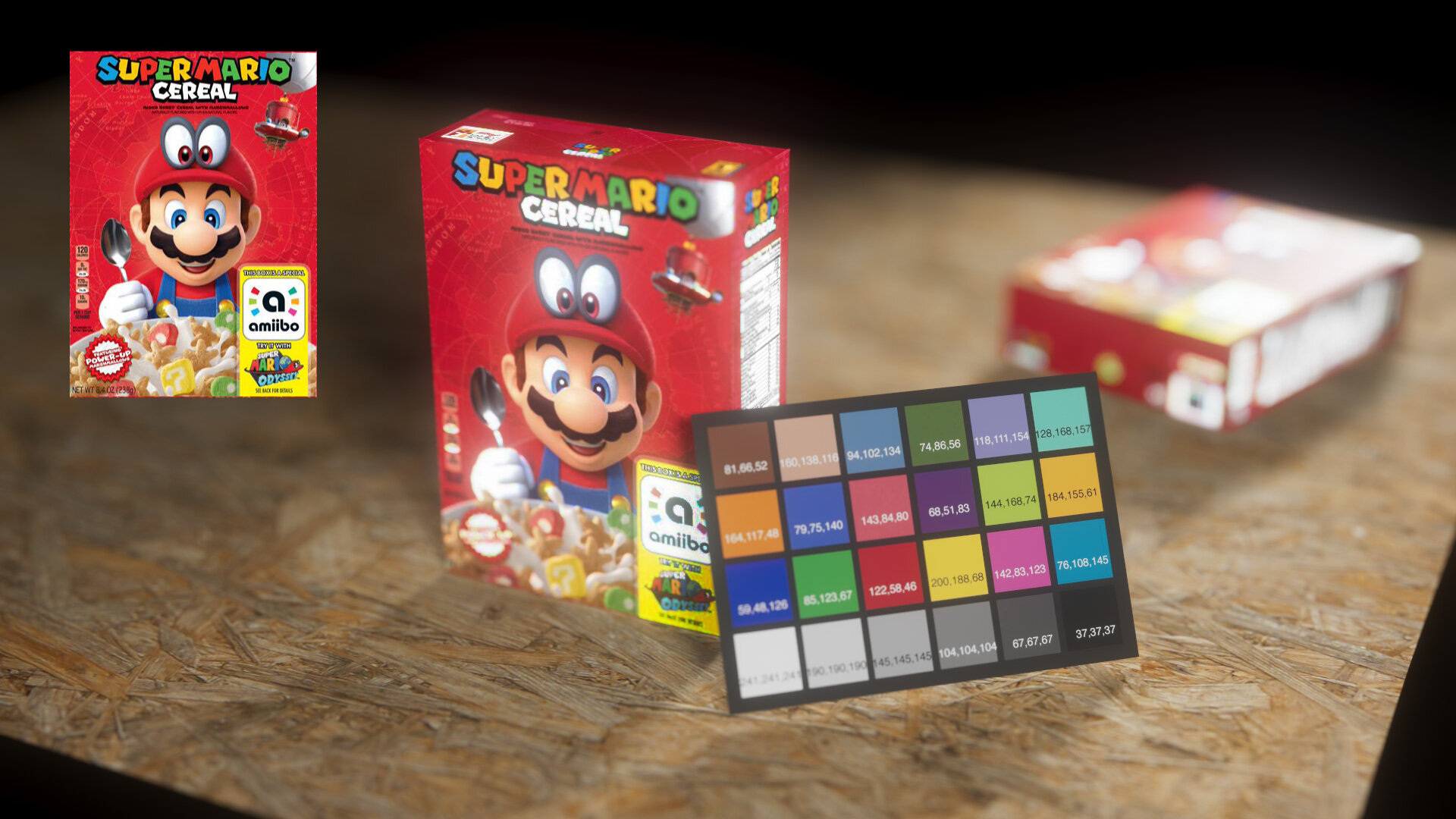
So add a third method of displaying EDR content to Apple’s roster: On these non-HDR displays, Apple has remapped “white” to something less than 255-255-255, leaving headroom for HDR values, should they be called for. The operating system is complicit in this trickery, so the Digital Color Meter eyedropper shows “white” as 255, as do screenshots.2
With Catalina, Apple quietly changed what “white” means for millions of Macs, and none of us noticed.
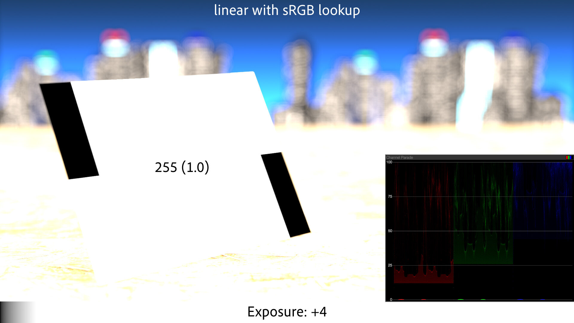
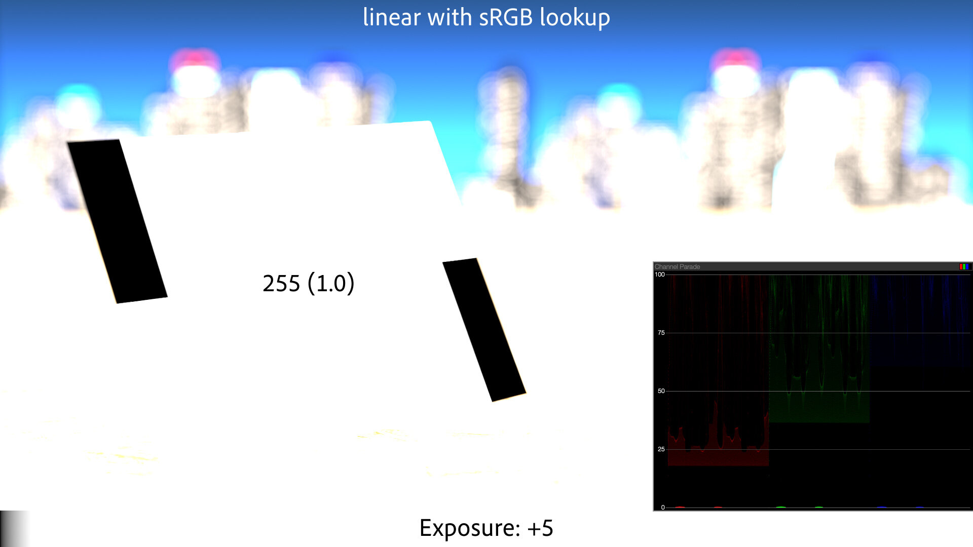
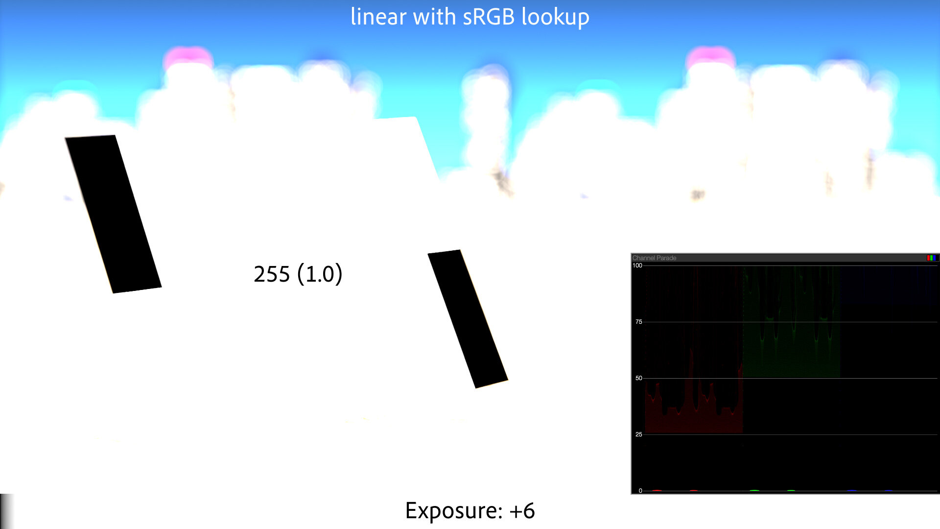
Think of it this way: This EDR display philosophy is so important to Apple that they are willing to spend battery life on it. When you map “white” down to gray, you have to drive the LED backlight brighter for the same perceived screen brightness, using more power. Apple has your laptop doing this all the time, on the off chance that some HDR pixels come along to occupy that headroom (or not: see update below). It’s a huge flex, and a strong sign of Apple’s commitment to an HDR future.
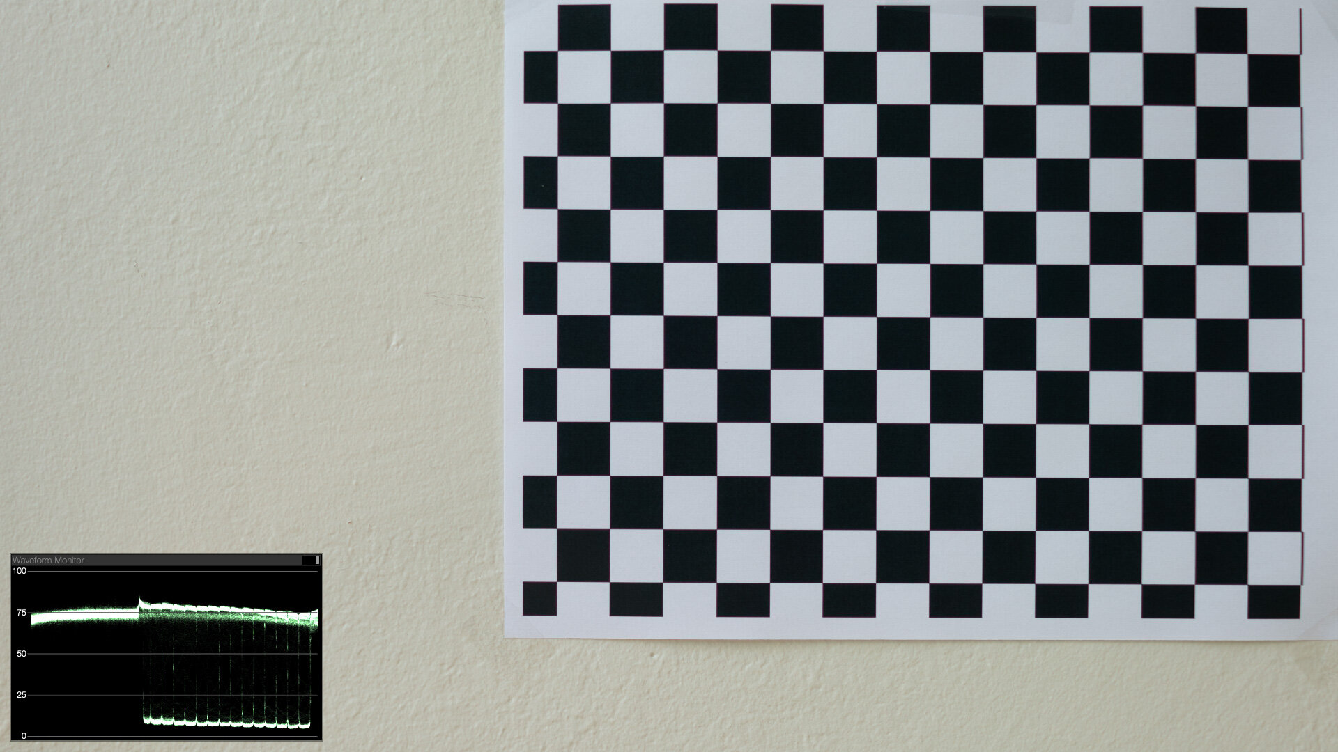
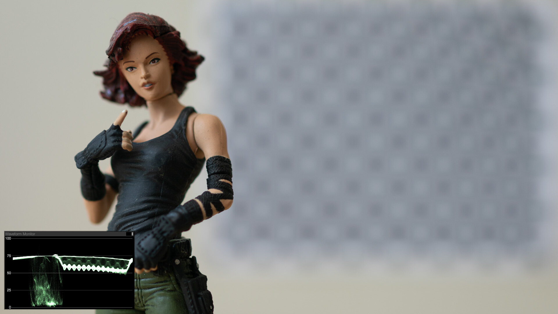
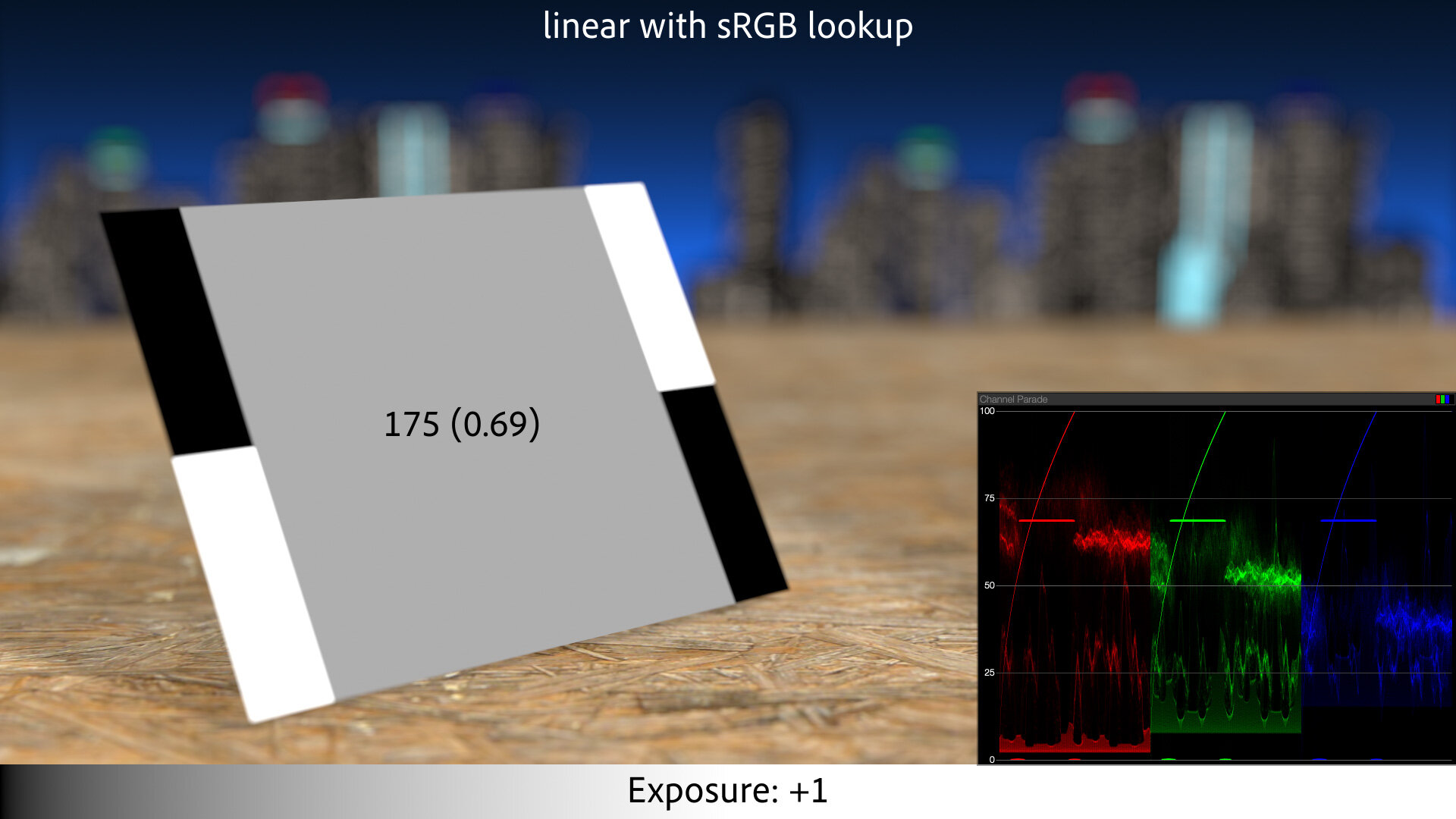
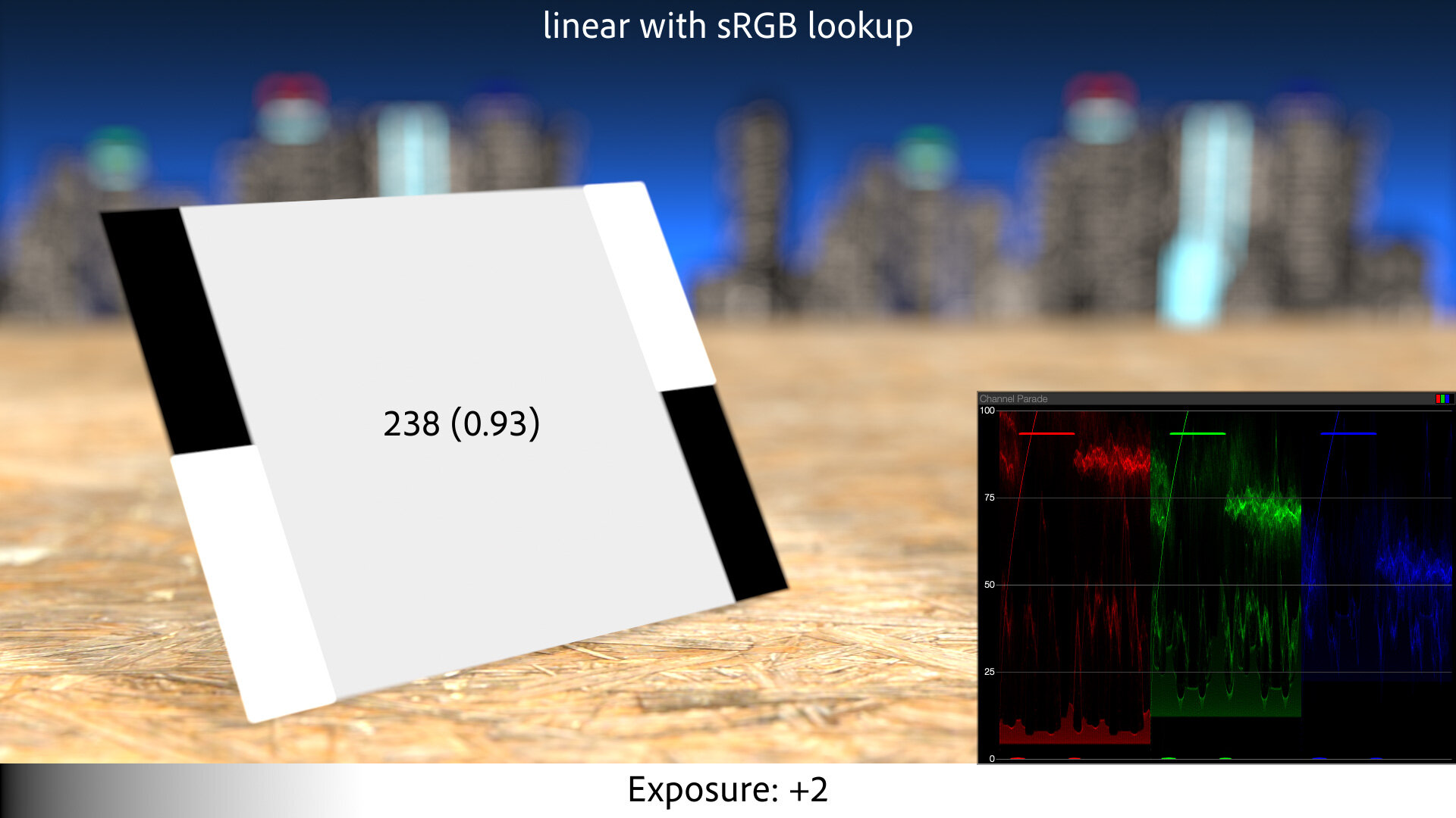
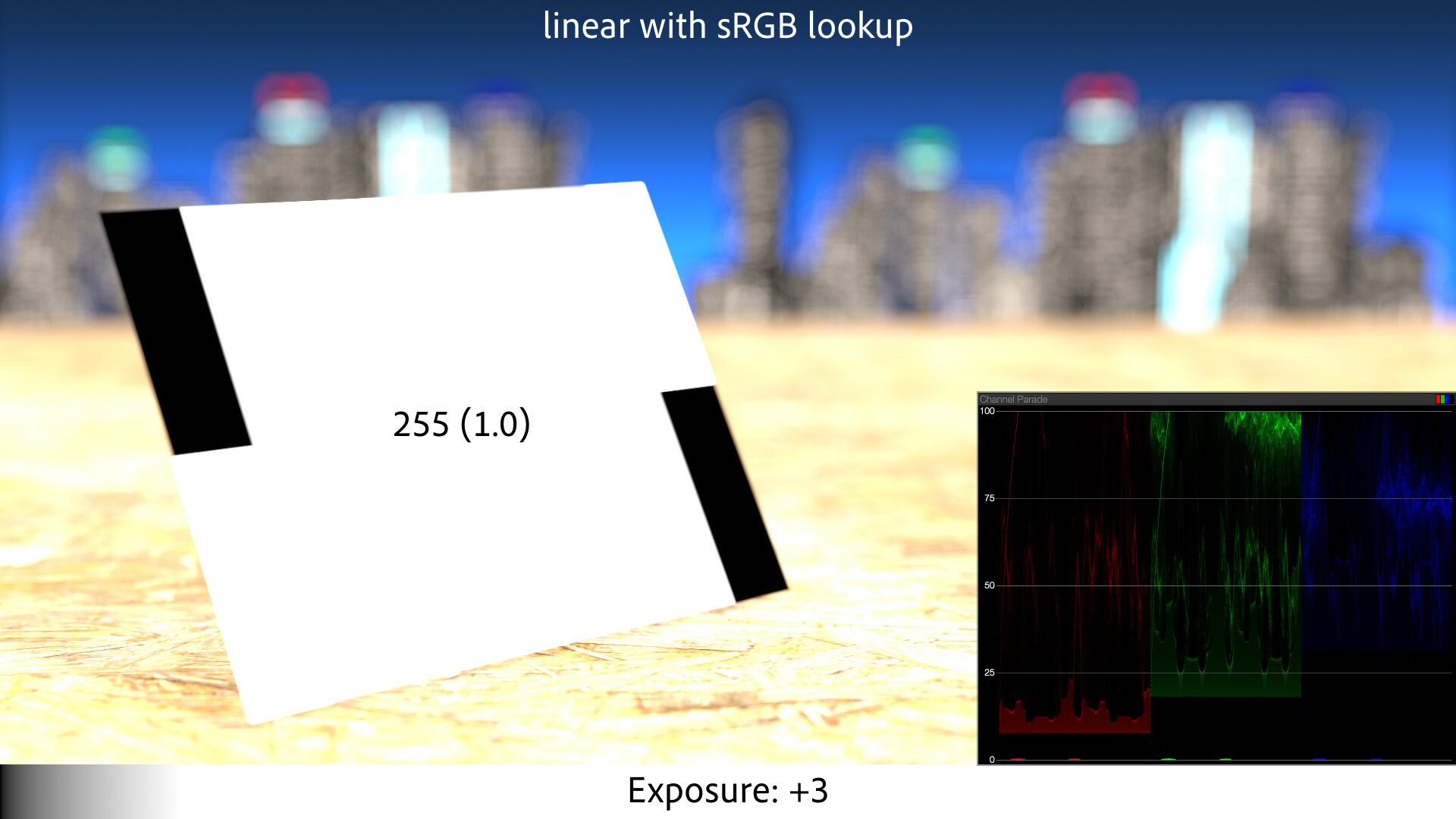
It also means that when you adjust your display brightness, macOS is commensurately adjusting the amount of headroom available for overbrights. Max out the brightness slowly and you can watch the HDR values gradually get pinched against the UI “white” as the headroom shrinks, until HDR white and Google white meet. Conversely, the lower your display brightness, the more headroom there is for EDR, although there will never be as much as on the Pro Display XDR, or even an iPhone 12 Pro.
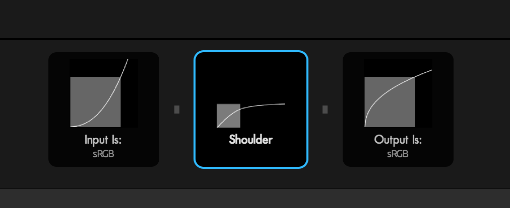
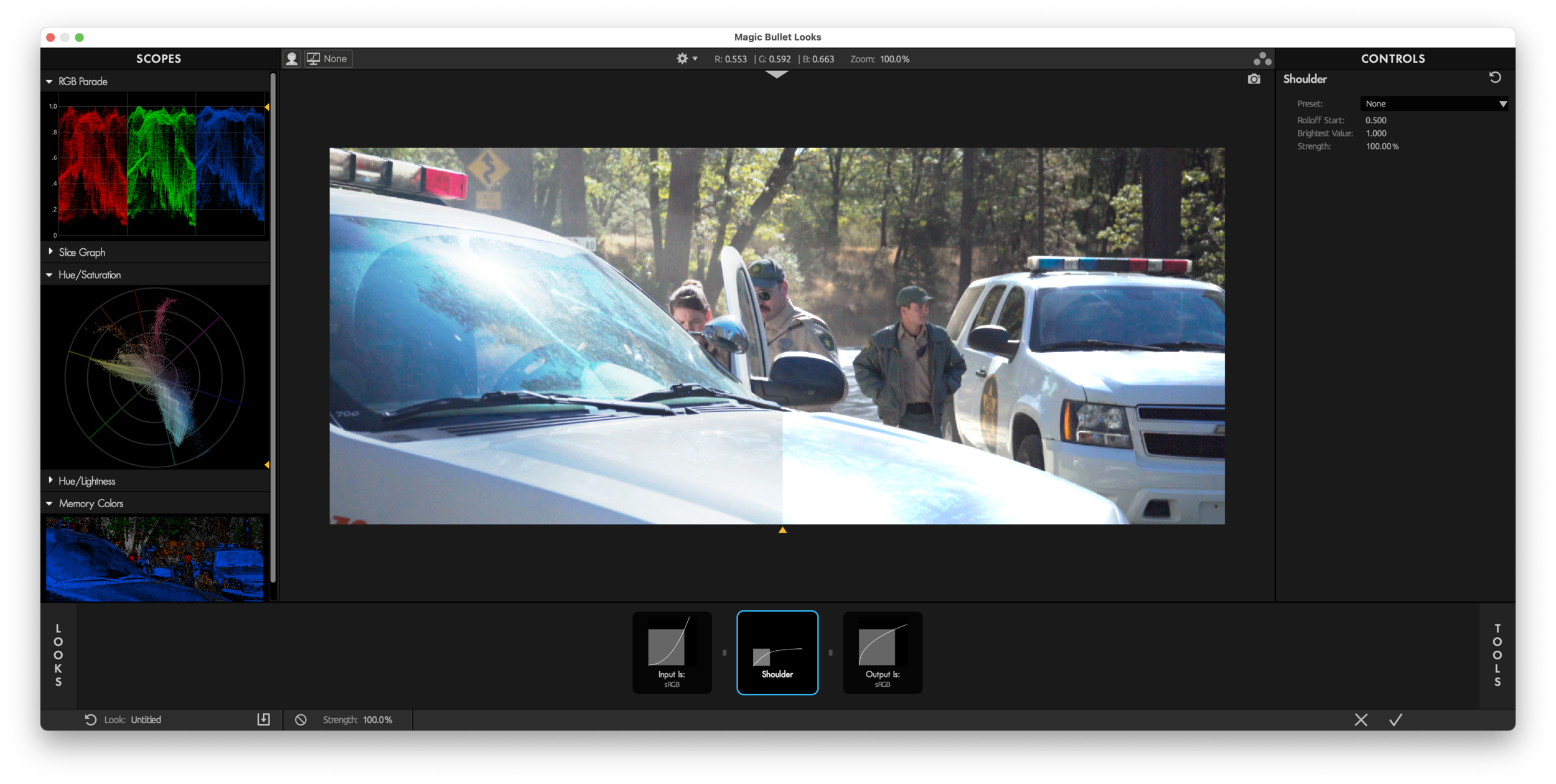
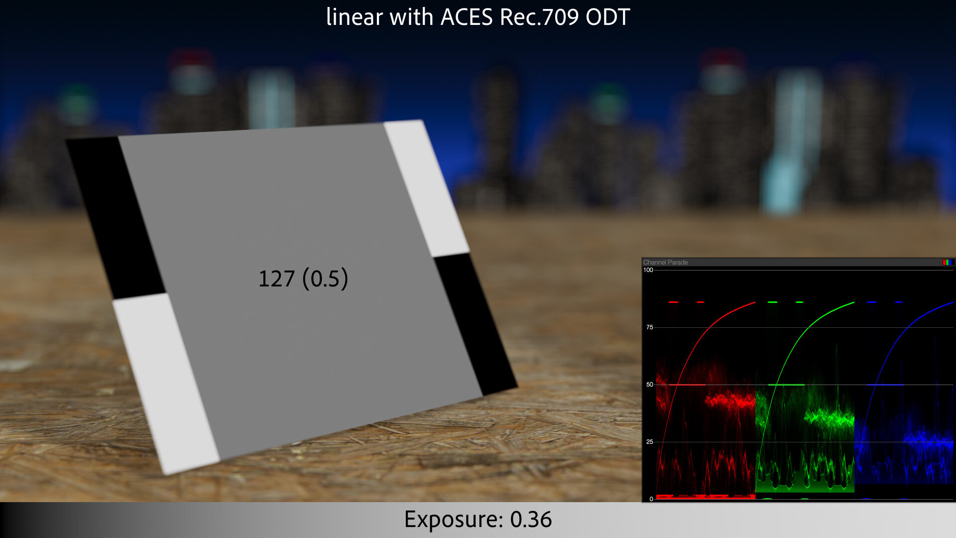
This variance in EDR capabilities across Apple devices is where a defining feature of HDR display comes into play. HDR standards like Dolby Vision were designed to accommodate screens of varying maximum brightness. The content is display independent, and when macOS goes to render it, it first asks the display how bright it can go, and then builds a bespoke lookup for that output brightness, correctly displaying the content within the available range.
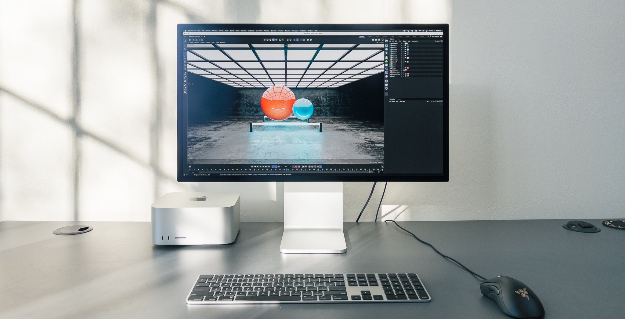
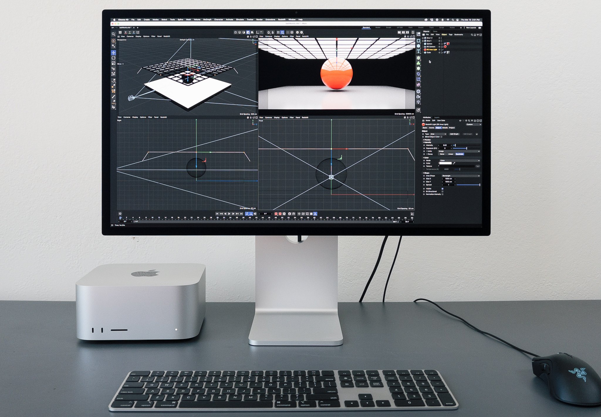
Apple handling this all for developers is a new kind of leg-up in the fraught field of color management. It’s actually trivial to display HDR content correctly on a semi-recent Mac. Apps such as DaVinci Resolve, Affinity Photo, and of course Final Cut Pro already do it, and you can expect to see it in Red Giant and Maxon tools as well.
Apple sells one very expensive, very capable device for displaying HDR — and literally millions of iPhones, iPads, and Macs that are also pretty darn good at it.
It’s an HDR World
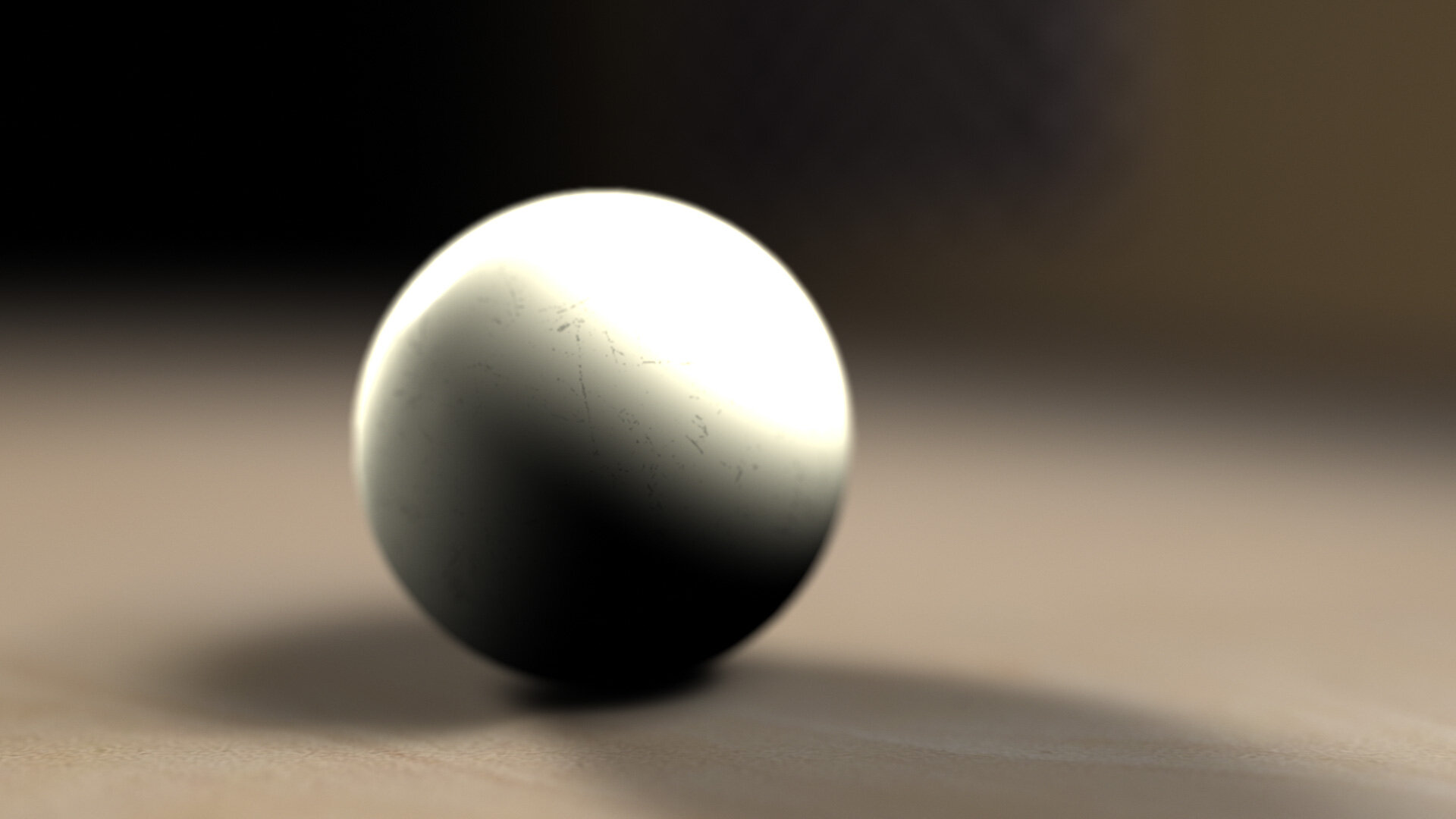
I’ve been critical of HDR as a creative tool. My North Star is the look of film, with its glorious highlight rolloff. Trying to sell me “brighter” was like screaming at me in the front row of a Metallica concert that the sound could go louder.
In the words of the great Roger Deakins:
If you create a balance of light and dark on set you expect that balance to be maintained throughout the process. I personally resent being told my work looks ‘better’ with brighter whites and more saturation.
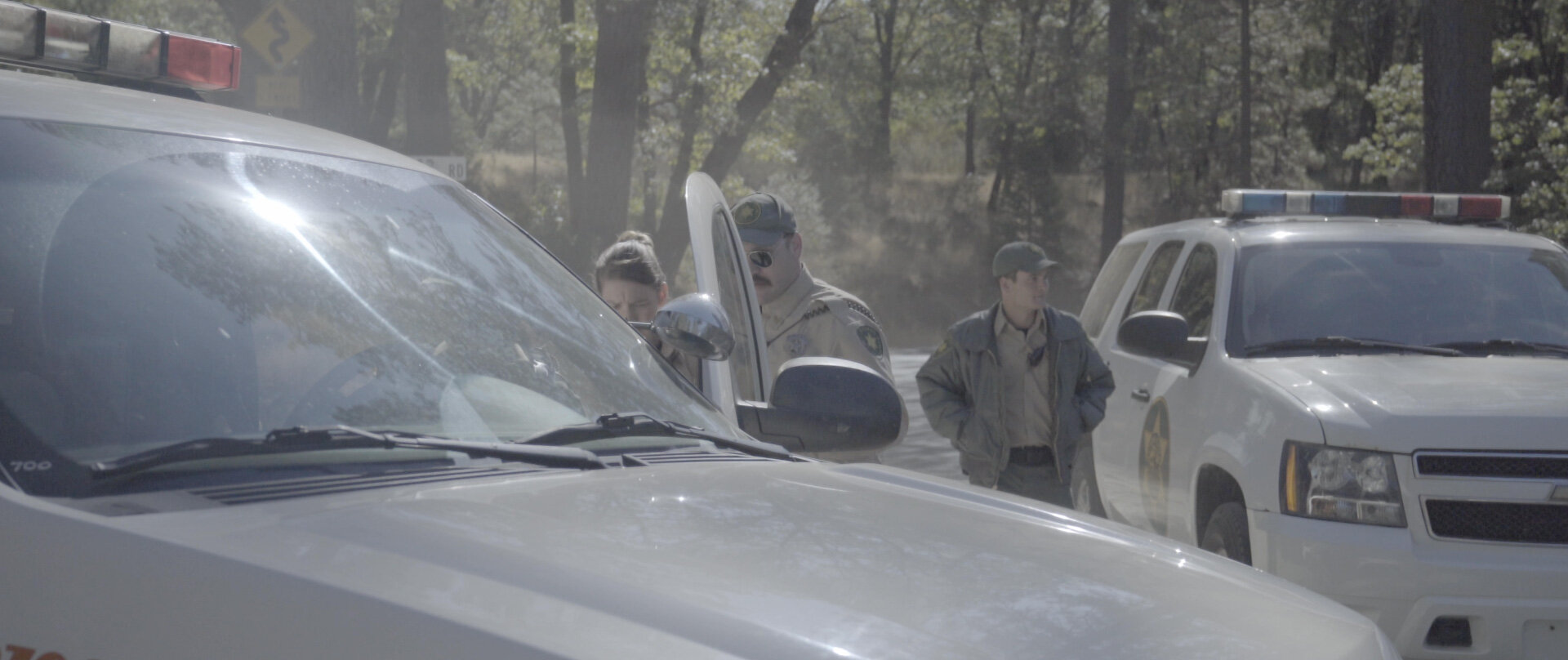
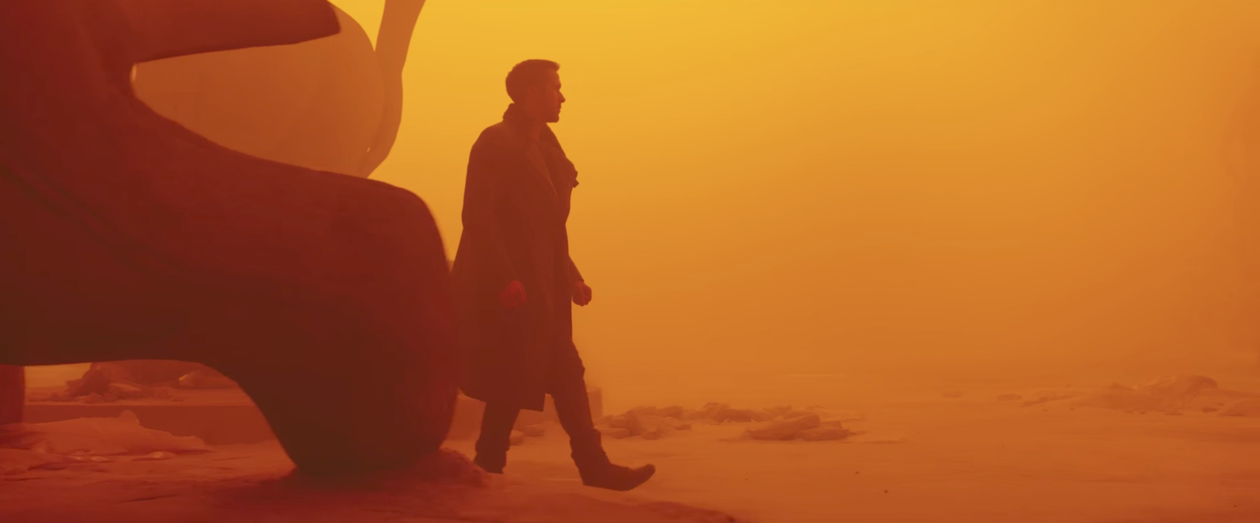
That was him talking about Sicario, five years ago. Since then, he’s shot a number of films, including Blade Runner 2049, which, damnit, takes artful creative advantage of HDR exhibition. For the most part, like Sicario, it intentionally occupies a narrow band of the available dynamic range. But at key parts of the story, certain colors eek outside of that self-imposed SDR container, to great effect. In a very emotional scene, brilliant pinks and purples explode off the screen — colors that not only had been absent from the film before that moment, but seemed altogether outside the spectrum of the story’s palette. Such a moment would not be possible without HDR.
Or would it? While there are certainly colors that digital projection can uniquely display, in many ways digital cinematography is still chasing the tremendous dynamic range and color fidelity of celluloid film. Properly projected film3 is, by any measure, HDR. So maybe I should warm up to digital’s latest efforts to live up to this legacy.